Ravi Klaassens
R
Designed byRavi Klaassens
View on AwwwardsOne-Shot Build Prompt
# Modern Dark Portfolio Website Design Implementation
Build a sophisticated dark-themed portfolio website with a dramatic artistic hero section featuring abstract digital art overlays and clean typography hierarchy.
## Layout Structure
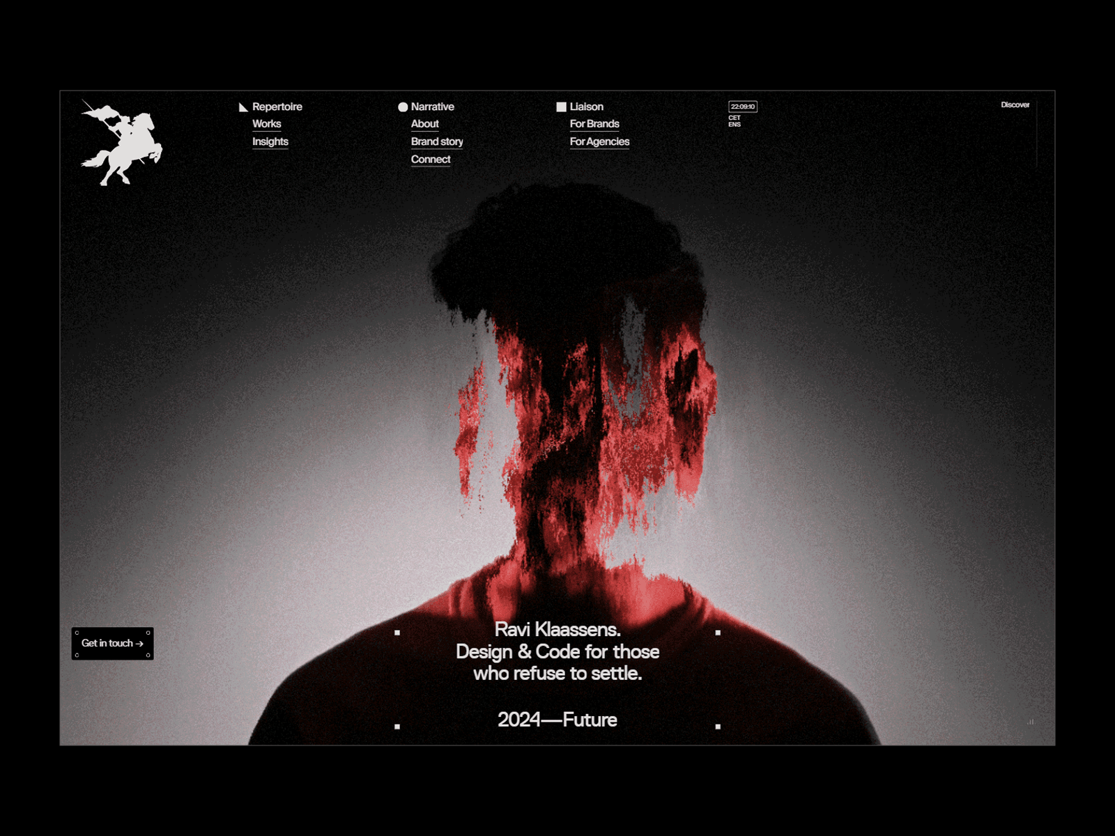
Create a full-viewport layout with a dark gradient background transitioning from deep black at the edges to lighter gray in the center. The design features a top navigation bar with logo and menu items, a central hero section with striking visual content, and overlay text elements positioned strategically across the composition.
## Key Components
**Navigation Header**: Minimal top navigation with white logo icon on the left, center-aligned menu items (Repertoire/Works/Insights, Narrative/About/Brand story, Liaison/For Brands/For Agencies), a time display (22:08:10 CET/DNS), and "Discover" link on the right.
**Hero Section**: Dominant central area featuring an artistic portrait silhouette with dramatic red paint/digital effect overlay creating an abstract double-exposure style effect. The figure appears to have flowing black hair with vibrant red digital distortion effects.
**Typography Overlay**: Bold white text centered over the image reading "Ravi Klaassens." followed by "Design & Code for those who refuse to settle." with decorative bullet points, and "2024—Future" at the bottom.
**Interactive Elements**: "Get in touch" call-to-action button in bottom left with arrow icon, subtle hover effects on navigation items.
## Visual Styling
Apply a sophisticated color palette dominated by deep blacks, whites for text contrast, and strategic use of vibrant red for accent elements. Use clean sans-serif typography with multiple font weights for hierarchy. The overall aesthetic should feel contemporary, artistic, and premium with subtle gradients and professional spacing.
## Responsive Behavior
Ensure the hero image scales appropriately across devices while maintaining the dramatic visual impact. Navigation should collapse to a mobile-friendly format on smaller screens, and text overlays should remain readable with proper scaling and positioning adjustments.
## Dark Mode Implementation
This design is inherently dark-themed. Maintain the dramatic contrast between the deep background gradients and bright white text elements. Ensure sufficient contrast ratios for accessibility while preserving the artistic moodiness of the design.
**Design specification**
<design-specification>
```jsonc
{
"project": {
"name": "Dark Portfolio Hero",
"description": "Dramatic dark-themed portfolio website with artistic hero section featuring abstract digital overlays and clean typography"
},
"tokens": {
"colors": {
"primary-900": { "light": "#000000", "dark": "#000000" },
"primary-800": { "light": "#1a1a1a", "dark": "#1a1a1a" },
"primary-700": { "light": "#2d2d2d", "dark": "#2d2d2d" },
"neutral-100": { "light": "#ffffff", "dark": "#ffffff" },
"neutral-200": { "light": "#f5f5f5", "dark": "#f5f5f5" },
"neutral-400": { "light": "#9ca3af", "dark": "#9ca3af" },
"accent-500": { "light": "#ef4444", "dark": "#ef4444" },
"accent-600": { "light": "#dc2626", "dark": "#dc2626" },
"background-gradient-start": { "light": "#000000", "dark": "#000000" },
"background-gradient-end": { "light": "#404040", "dark": "#404040" }
},
"typography": {
"families": { "sans": "Inter, system-ui, sans-serif" },
"sizes": { "xs": "12px", "sm": "14px", "base": "16px", "lg": "18px", "xl": "20px", "2xl": "24px", "3xl": "36px", "4xl": "48px" },
"weights": { "normal": "400", "medium": "500", "semibold": "600", "bold": "700" },
"lineHeights": { "tight": "1.2", "normal": "1.5", "relaxed": "1.8" },
"letterSpacing": { "tight": "-0.025em", "normal": "0em", "wide": "0.05em" }
},
"spacing": {
"xs": "4px",
"sm": "8px",
"md": "16px",
"lg": "24px",
"xl": "32px",
"2xl": "48px",
"3xl": "64px",
"rationale": "Generous spacing for premium feel with smaller increments for precise control"
},
"radii": {
"sm": "4px",
"md": "6px",
"lg": "8px",
"xl": "12px"
},
"shadows": {
"sm": { "light": "0 1px 2px rgba(0,0,0,0.05)", "dark": "0 1px 2px rgba(0,0,0,0.8)" },
"md": { "light": "0 4px 6px rgba(0,0,0,0.1)", "dark": "0 4px 6px rgba(0,0,0,0.9)" },
"lg": { "light": "0 10px 15px rgba(0,0,0,0.1)", "dark": "0 10px 15px rgba(0,0,0,0.9)" }
}
},
"screens": [
{
"name": "PortfolioHero",
"route": "/",
"layout": "Full viewport with radial gradient background, top navigation, centered hero content with text overlays",
"components": [
{
"name": "TopNavigation",
"type": "header",
"properties": {
"background": "transparent",
"color": "tokens.colors.neutral-100",
"fontSize": "tokens.typography.sizes.sm",
"fontWeight": "tokens.typography.weights.medium",
"padding": "tokens.spacing.lg"
},
"states": {
"default": {},
"hover": { "opacity": "0.8" }
}
},
{
"name": "LogoIcon",
"type": "svg",
"properties": {
"color": "tokens.colors.neutral-100",
"width": "40px",
"height": "40px"
}
},
{
"name": "HeroImage",
"type": "figure",
"properties": {
"position": "absolute",
"width": "100%",
"height": "100%",
"backgroundImage": "radial-gradient(circle, tokens.colors.background-gradient-end 0%, tokens.colors.background-gradient-start 70%)",
"zIndex": "1"
}
},
{
"name": "ArtisticOverlay",
"type": "div",
"properties": {
"position": "absolute",
"backgroundBlendMode": "multiply",
"zIndex": "2"
}
},
{
"name": "HeroTitle",
"type": "heading",
"properties": {
"fontSize": "tokens.typography.sizes.4xl",
"fontWeight": "tokens.typography.weights.bold",
"color": "tokens.colors.neutral-100",
"textAlign": "center",
"lineHeight": "tokens.typography.lineHeights.tight",
"zIndex": "3"
}
},
{
"name": "HeroSubtitle",
"type": "paragraph",
"properties": {
"fontSize": "tokens.typography.sizes.xl",
"fontWeight": "tokens.typography.weights.normal",
"color": "tokens.colors.neutral-100",
"textAlign": "center",
"lineHeight": "tokens.typography.lineHeights.normal",
"marginTop": "tokens.spacing.md"
}
},
{
"name": "YearLabel",
"type": "text",
"properties": {
"fontSize": "tokens.typography.sizes.lg",
"fontWeight": "tokens.typography.weights.medium",
"color": "tokens.colors.neutral-100",
"textAlign": "center",
"marginTop": "tokens.spacing.xl"
}
},
{
"name": "CTAButton",
"type": "button",
"properties": {
"background": "tokens.colors.primary-800",
"color": "tokens.colors.neutral-100",
"fontSize": "tokens.typography.sizes.sm",
"fontWeight": "tokens.typography.weights.medium",
"padding": "tokens.spacing.sm tokens.spacing.md",
"borderRadius": "tokens.radii.sm",
"border": "1px solid tokens.colors.neutral-400"
},
"states": {
"default": {},
"hover": { "background": "tokens.colors.primary-700" }
}
}
]
}
]
}
```
</design-specification>Copy this prompt and paste it into your AI coding assistant to build this design.